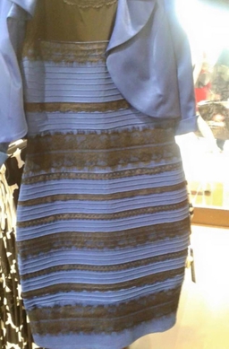
What color is the dress? Chances are, you’ve probably stumbled upon this dress dozens of times before already. It’s an optical illusion that specifically targets your eyes’ ability to perceive color, and they can be really trippy. Take the infamous dress for example. While some see it as gold and white, others see blue and black. The latter has been scientifically proven to be right, but why do our eyes seemingly deceive us to think that it could even be gold and white?
It turns out our brains are really stupid. Admittedly, this is an oversimplification, but color is one of the few things that our brain is just somehow incapable of processing. Some neuroscientists say that color is “contextual” and guided by “inference.” Take a look at this bowl of strawberries. You might think it’s red, but a closer inspection of the hex code would suggest that it’s a lot closer to a shade of turquoise or even gray. It’s really just a cyan filter laid on top of an otherwise normal scene of strawberries, which we perceive as red. In the context of this photo, we see the structure and texture of strawberries and think: “that must be red!” when it really isn’t.

A similar principle applies to the dress. In the photo, we can see that there’s a warm yellow light illuminating in the background. That light will shine on the dress, which causes it to reflect a wavelength different from the reflected blues and blacks. In this case those reflected wavelengths might resemble white and gold more as it more closely aligns with the brighter and warmer background. If you still haven’t found the blue & black yet… try harder.
The different uses of color can elicit different emotions and reactions, and that is why most artists go on to study at least some basic color theory. Warm colors (reds, oranges, yellows) evoke happiness, passion, and anger while cool colors (greens, blues, purples) evoke sadness, isolation, and serenity. Skillful usage of colors can add to an artwork’s overall meaning and composition, but as we’ve seen through the dress these established emotional cues through color could easily be manipulated by lighting, shadows, and filters.
When I paint, I try to mix a variety of tones – from light to dark – of all the colors I need for my palette. In areas with more shadows, sometimes I might need entirely new colors to blend and adjust the hue so that it becomes more desaturated. In lighter areas, I try to keep white as the primary color and only modify it when I absolutely need to. And if I still don’t think I’ve mastered a color palette, I’ll take a photo of it and run it through different filters. It’s a great way to preview how lighting or color shifts might affect the mood—and to better reflect physical changes in the final piece.