This post is going to be a departure from my previous blogs in that it’ll be more laid-back. I wanted to start a series where I could freely talk about different ways data is used in art.
Okay, so you’ve probably heard the term “visualization” before. Whether it’s through an art class or not, you likely know that it has to do with seeing. And to a great extent, you’d be correct. But there are varying levels of visualization.
For example, you can (probably) see a spring dandelion in a patch of grass—and in great detail if you get down on your knees and really lean in. However, you may not be able to see every individual seed, every pore, every strand of xylem, or every hydrogen bond that holds these structures together.
Also, you’ve likely heard countless stories about the tragedies of wars such as World War II, and you can probably grasp, to some extent, the magnitude of suffering. But if you’ve only learned about the war through one lens—say, in your American History class—then it might be easy to sympathize with and imagine the hardships of the ~400,000 Americans who died in the war. While this figure may sound significant, it can be much harder to visualize the 27 million Russians and 20 million Chinese soldiers and civilians who perished—each with a distinct family, occupation, and life.
The point is: it’s really hard to truly visualize something. You can never just look at a number and fully understand it. That’s where graphics come into the picture.
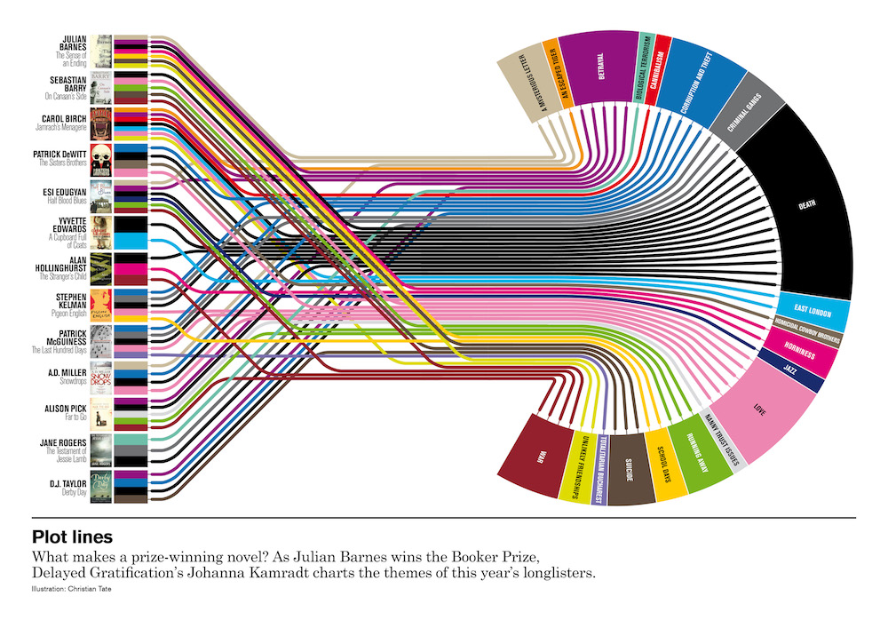
Data visualization is a type of visualization that translates data (crazy, I know) into a more comprehensible medium. This could be through graphs, charts, bolded numbers, pie slices, or color-coded categories—the list goes on. But ultimately, an effective visualization should inform and expand someone’s understanding of something that wasn’t previously known, in a visually engaging way.
Let’s go back to my WWII example. Say you want to visualize the death toll of the war by country. One way you could do that is by plopping the data into a pie chart. While this would technically convey the information, I personally wouldn’t find it very appealing. A more impactful approach (and something you may have seen on YouTube Shorts) would be to simulate a population area for each country, proportional to the number of deaths.
Granted, it would be nearly impossible to represent every single casualty, so I’m not suggesting a 1:1 simulation. Instead, I’d use Blender or another 3D modeling tool to generate squares side by side, with their areas proportional to each country’s losses. The effect would be most powerful as a video, starting with countries that lost the fewest lives and ending with Russia’s overwhelming square. What I’m describing is pretty much what Neil Halloran did in his incredible video, The Fallen of World War II. Please check it out, I think it’s an incredible example of effective data visualization.
That’s just one example of what visualization can do. What I’m talking about here is largely informal, of course—you wouldn’t publish your life’s research in the form of a YouTube Short. But it is a valid way to communicate information to an audience that might not otherwise understand the scale of something.
I like to think of it as similar to how Americans use weird objects as makeshift units of measurement. “That tree branch is three bananas wide!” or “That rock was as big as half a soda can!” If you can find a way to capture someone’s imagination—even if it’s obscure or a little ridiculous—I think you’re on your way to success.


